Library renovations attract communities
Library renovations attract communities
Posted July. 18, 2023 08:01,
Updated July. 18, 2023 08:01


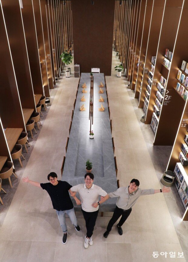
“There isn’t enough space for people to wind down and relax, so people head to cafes. That is the social cost. Libraries should be a place for people to relax,” said Lee Byeong-wook (age 42), Kim Hong-cheol (age 38), and Kim Seong-jin (38), directors of Mate Architects. This architect office designs the interior/exterior of public libraries.
“Libraries are just as important as plazas or parks. Libraries should not compete with study cafes, but with cafes like Starbucks or playgrounds,” they said, whom your reporter met with at the Achasan Forest Library located in Gwangjin-gu, Seoul, on July 11.
Since winning the President’s Award for the 2020 Republic of Korea Best Space Cultural Award in recognition for designing the youth library “To Space 1216” (joint design) located in Jeonju, North Jeolla Province, they have designed eight public libraries.
The Achasan Forest Library opened in August last year and is one of the libraries they designed, known for its café-like atmosphere. Built on a site previously designated as a garbage dump, the two-storied building stands 8.3 meters tall over an area of 388.92㎡, with one side built with glass. A full view of the Achasan Mountain comes into view. The terrace was designed for people to relax and talk to each other. “We placed desks where people could sit and take in the view; we didn’t want to block the light shining through the class with bookshelves,” Kim said. “We designed it in a way so that anyone could enjoy the view, even for those that are not reading.”
The library, designed to seat 60 people, has been visited by 117,098 visitors since opening in June this year. Many have posted photos on Instagram. “People that used to go to cafes are returning to libraries,” said Kim.
The Jayang 4 Library, which opened in January this year, was remodeled by Made Architect as well. The previous library, which covered 231㎡ of the first floor of the community service center and opened in 2008, had bookshelves stacked so high that they almost touched the ceiling. This made the room quite dark, even when the light was on. The room was dominated by bookshelves, making space tight for readers to sit and read. The architects designed the space like an exhibition, creating a space with an open feeling. They placed bookshelves of different heights, which gave a dynamic feel. Smooth lighting was placed on the ceiling and bookshelves, shedding light as if books were exhibition items. The library saw a 43% increase in visitors after the remodeling.
always99@donga.com
Headline News
- Lee acquitted of subornation of perjury charges in first trial
- Trump’s second term to pressure S. Korea to join China export controls
- 25 cases of technology theft to overseas caught this year
- Russia warns S. Korea over supplying lethal weapons to Ukraine
- Lee Jae-sung scores header goals in consecutive Bundesliga matches


